DESIGNING WITH LETTERING: WORDS AND IDENTITY IN ARCHITECTURAL SURFFACES
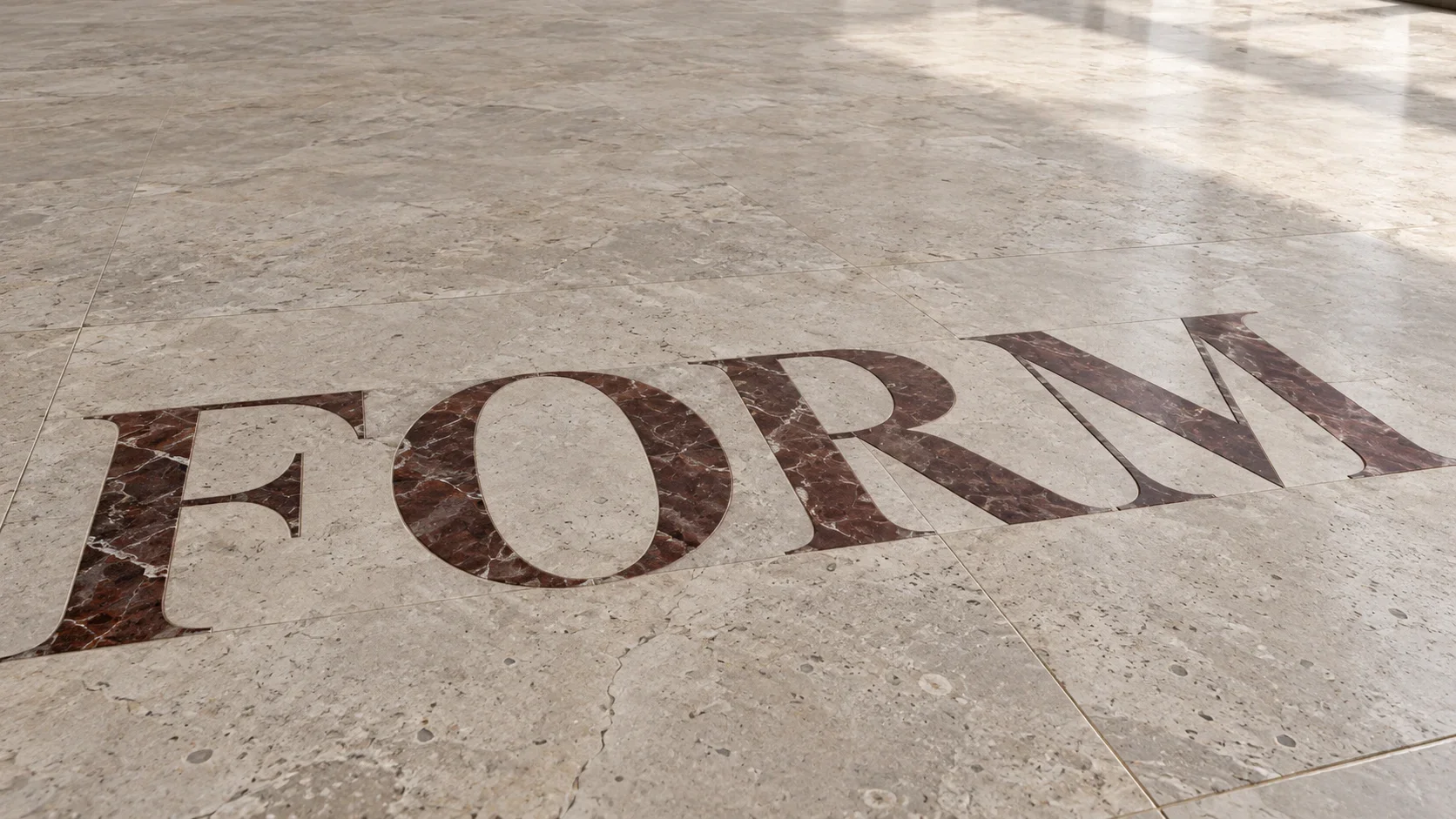
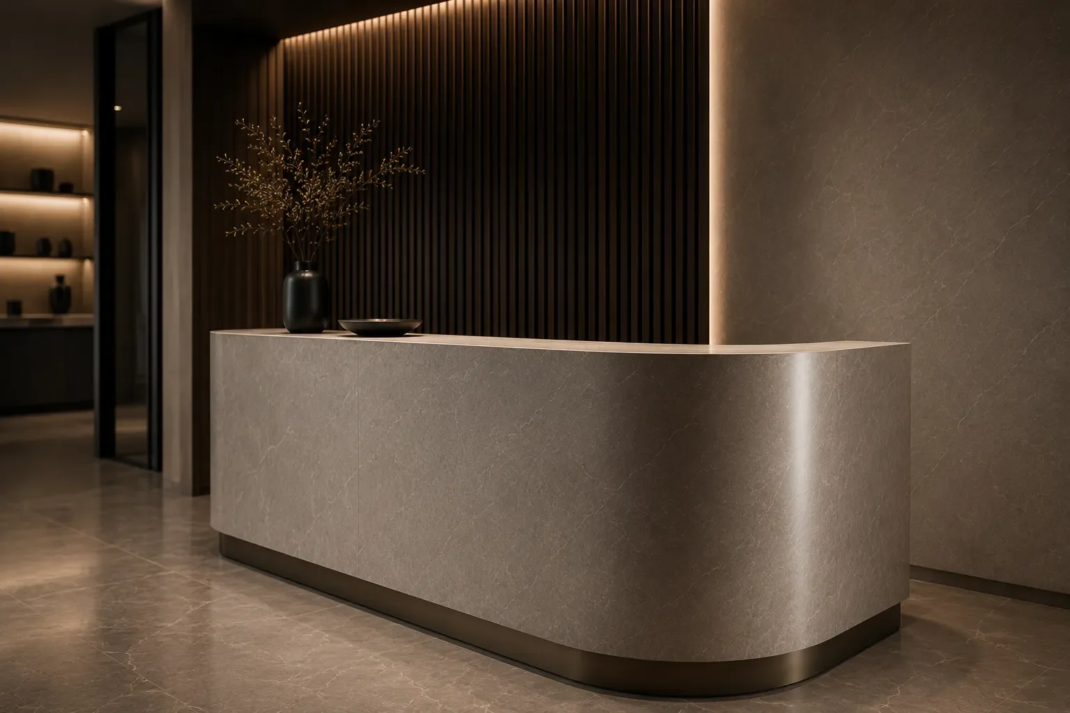
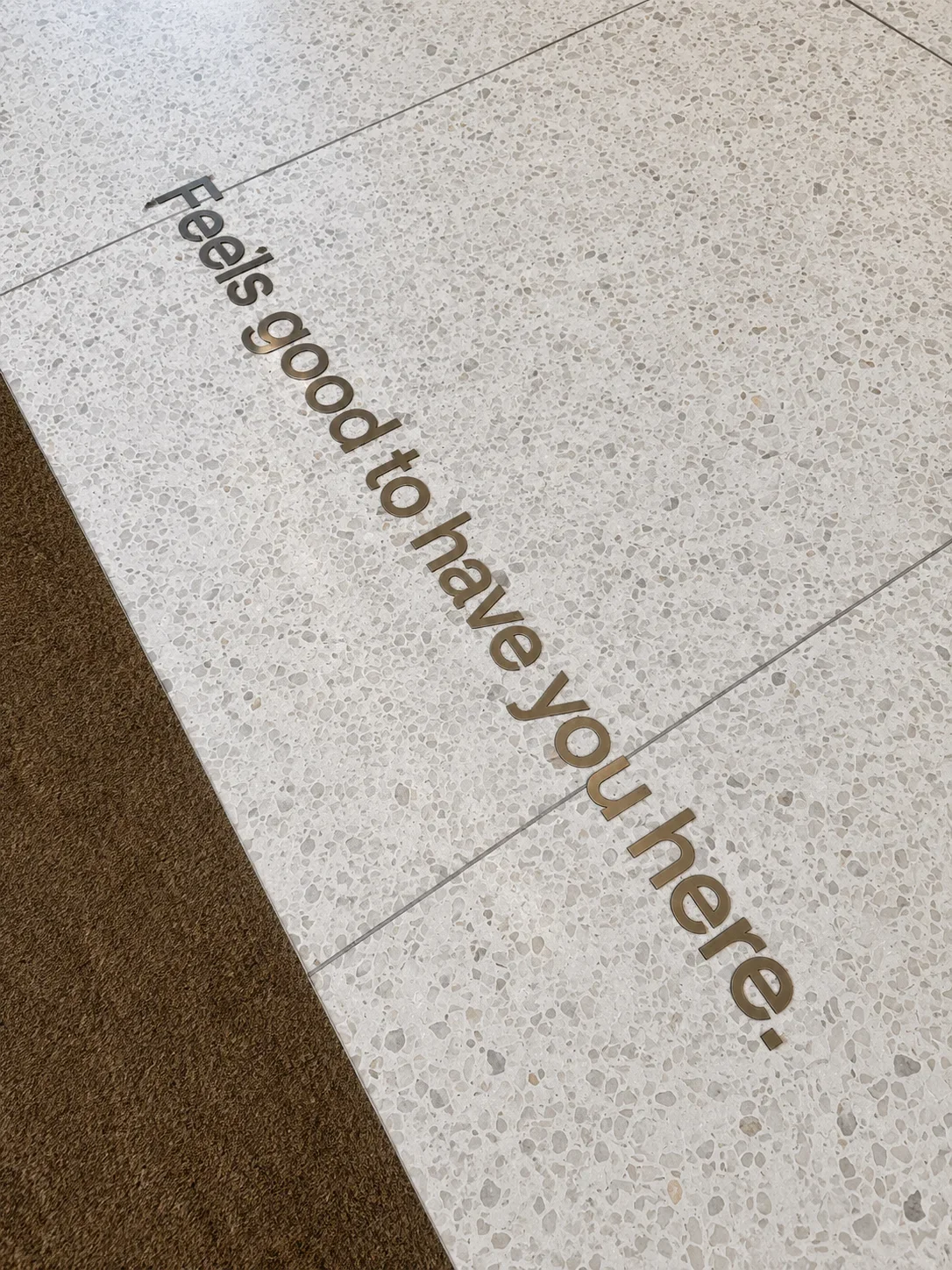
Lettering changes when it becomes part of a building. A name set into a floor or incorporated into a reception area is experienced through its material, scale and surroundings, as well as the words themselves.
For architects and interior designers, this creates an opportunity to consider identity within the fabric of a space. The choice of typeface is the beginning; how that lettering meets the architecture gives it its character.
Begin with the setting
Consider where the lettering will be seen and how people will encounter it.
A name behind a reception desk may need to read clearly from an entrance. A floor detail might be discovered gradually as someone moves through a space. Lettering viewed from above will have a different relationship with its surroundings from words seen at eye level.
These viewpoints help establish the size, position and prominence of the design.
Give the typeface room
A typeface that works on a screen or printed page can feel different at architectural scale. Fine strokes, compact spacing and small internal details deserve particular attention when the design moves into a physical material.
Look at the letterforms individually and as a complete word. The spaces between letters contribute to the rhythm of the composition, while the surrounding empty space determines whether it feels generous, restrained or crowded.
Where lettering forms part of an established brand, retain the original artwork as the reference and discuss any proposed adjustments with the designer.

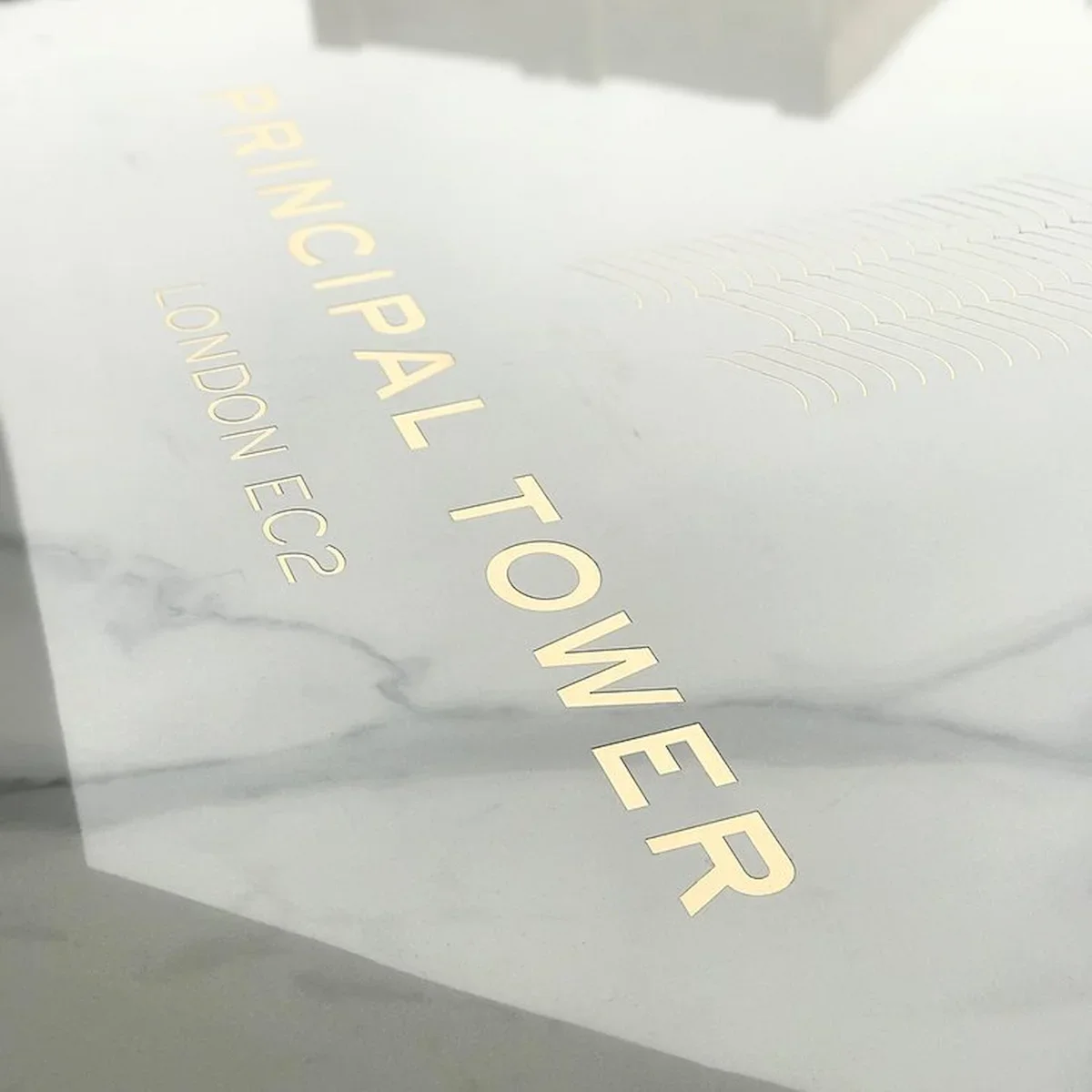
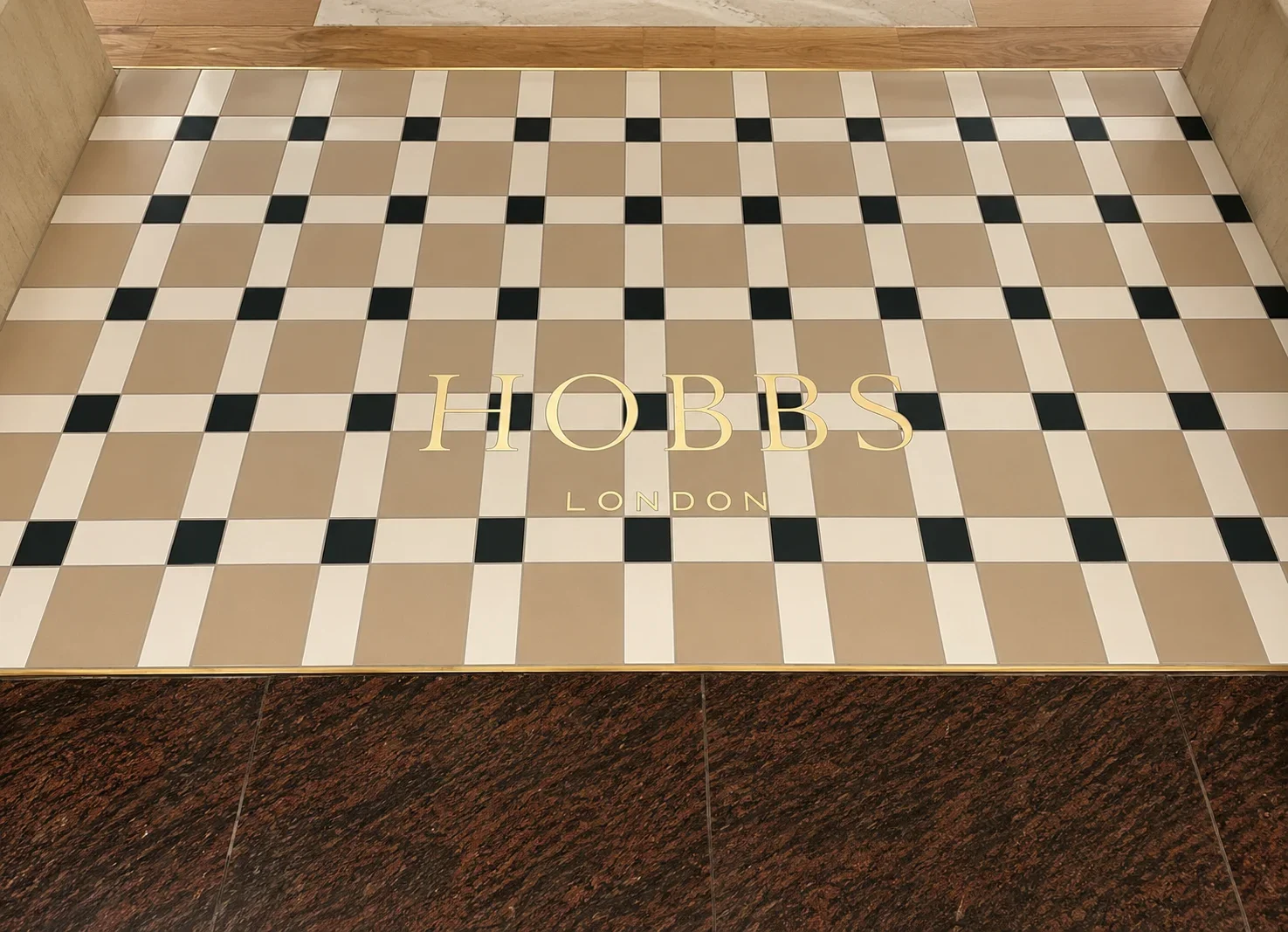
Let material contribute
Material becomes part of the expression of the lettering.
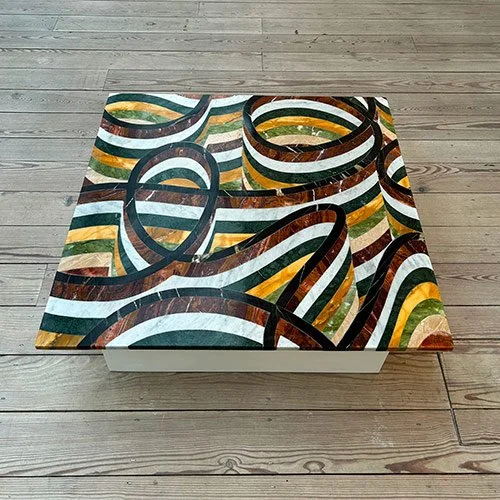
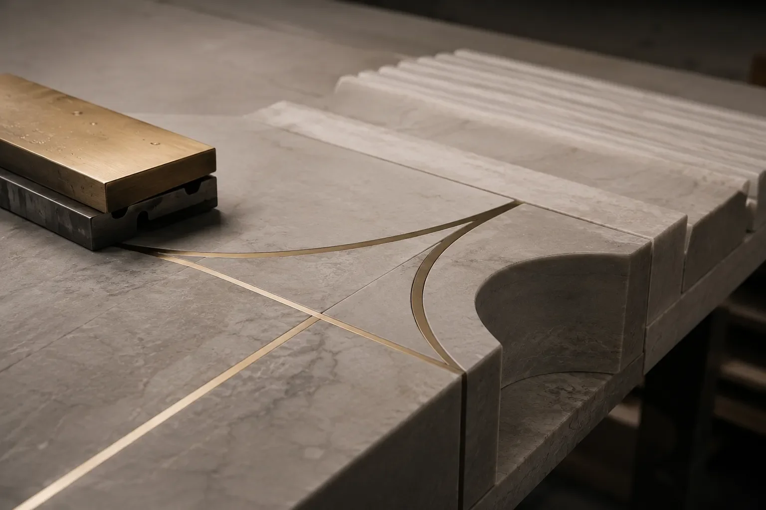
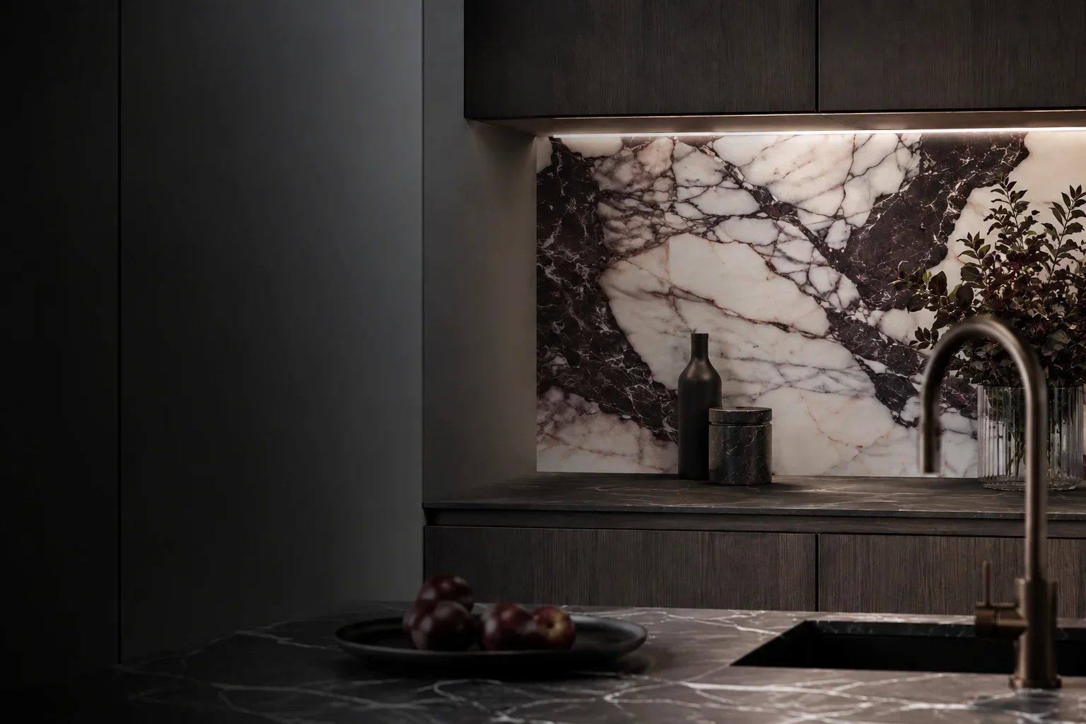
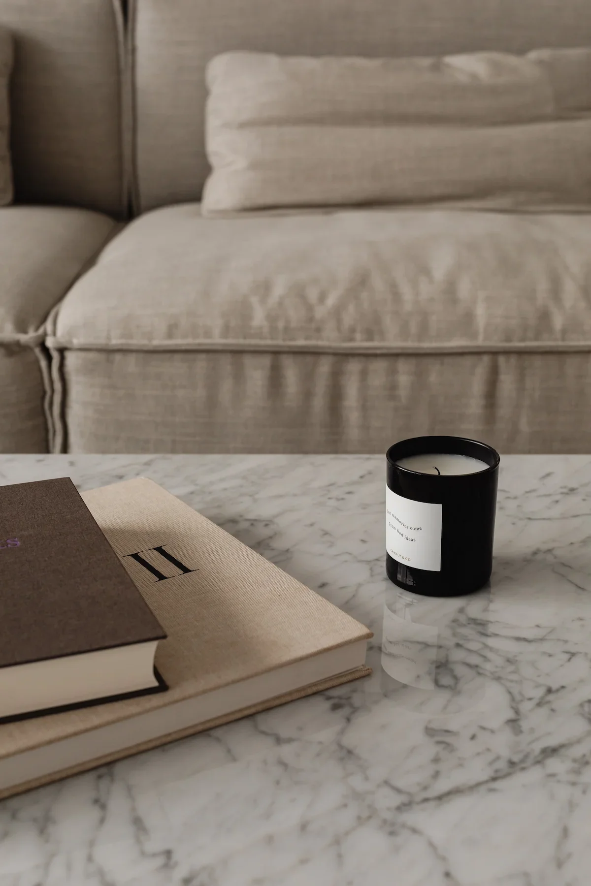
A contrasting inlay can give words a clear presence within a surface. A closer tonal relationship can create a quieter detail, inviting a second look. Veining, texture and finish also contribute to the composition: a letter placed within a strongly patterned surface will read differently from one set against a uniform background.
The useful question is how much attention the lettering should command within the room.
Connect it to the architecture
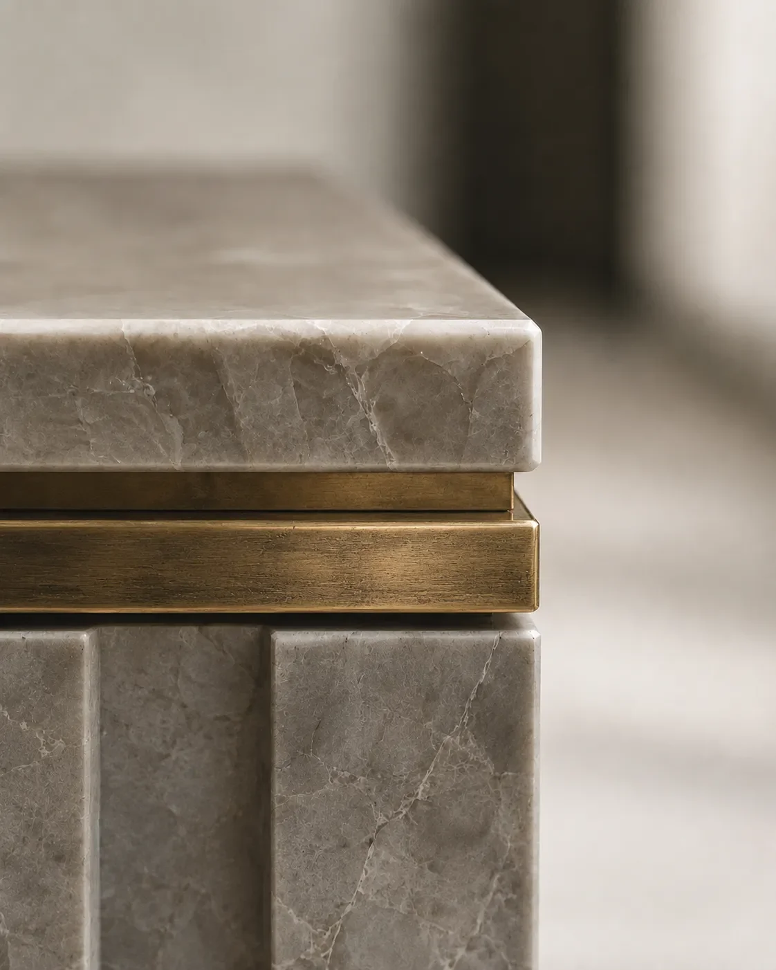
Look beyond the word itself. Nearby joints, borders, changes in material and the lines of surrounding joinery can all influence where lettering sits most comfortably.
An alignment might connect a name to the reception desk beneath it. A floor inscription might take its position from an entrance or a wider geometric pattern.
These relationships help lettering feel considered within the overall scheme.
Bring the design into fabrication
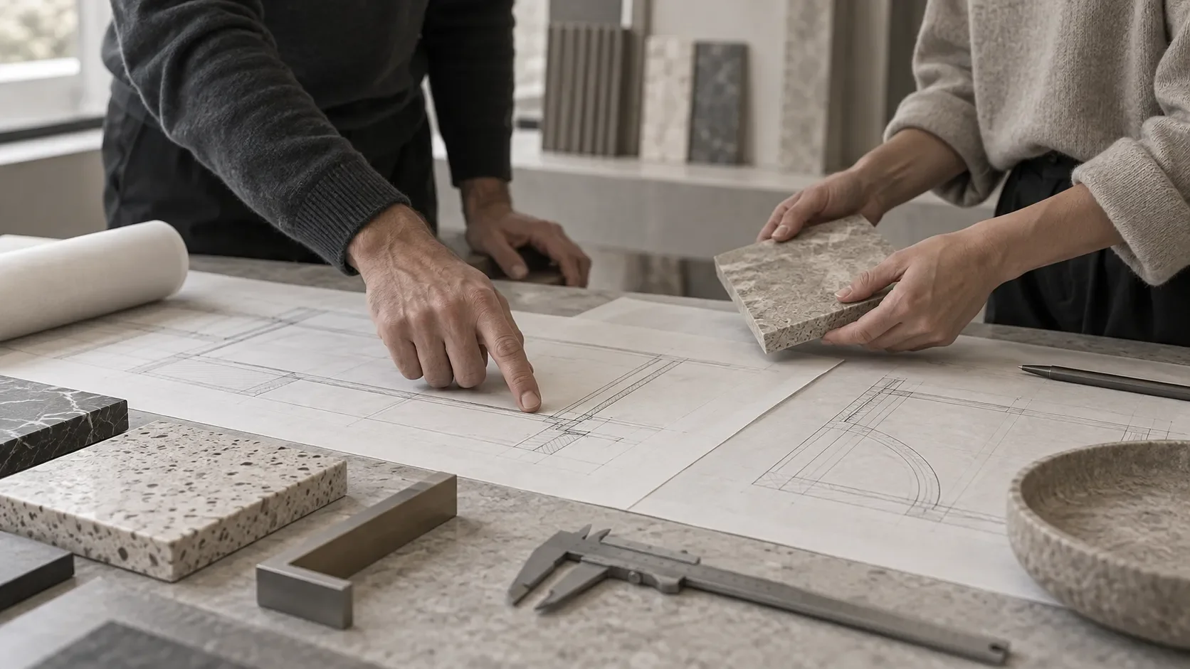
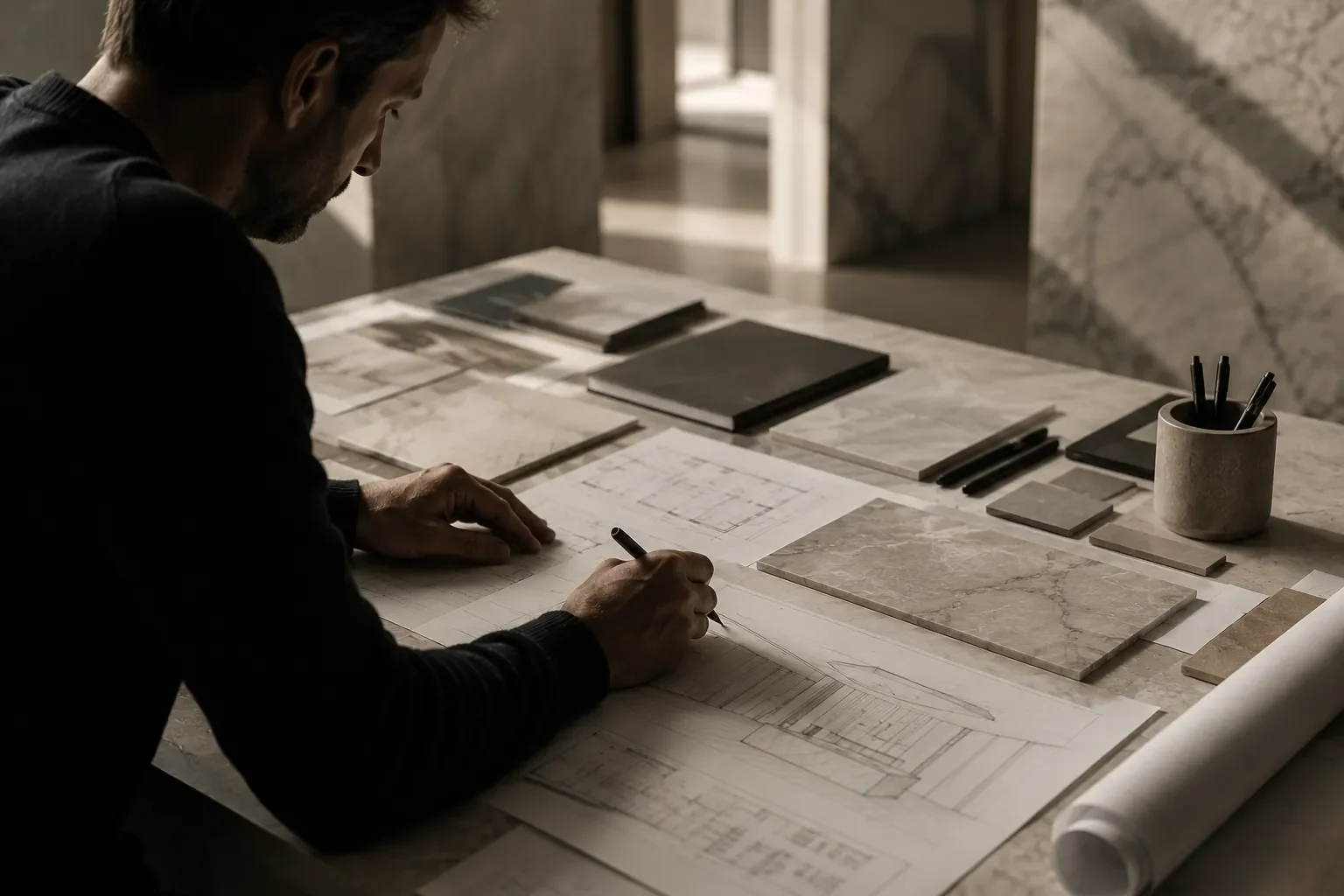
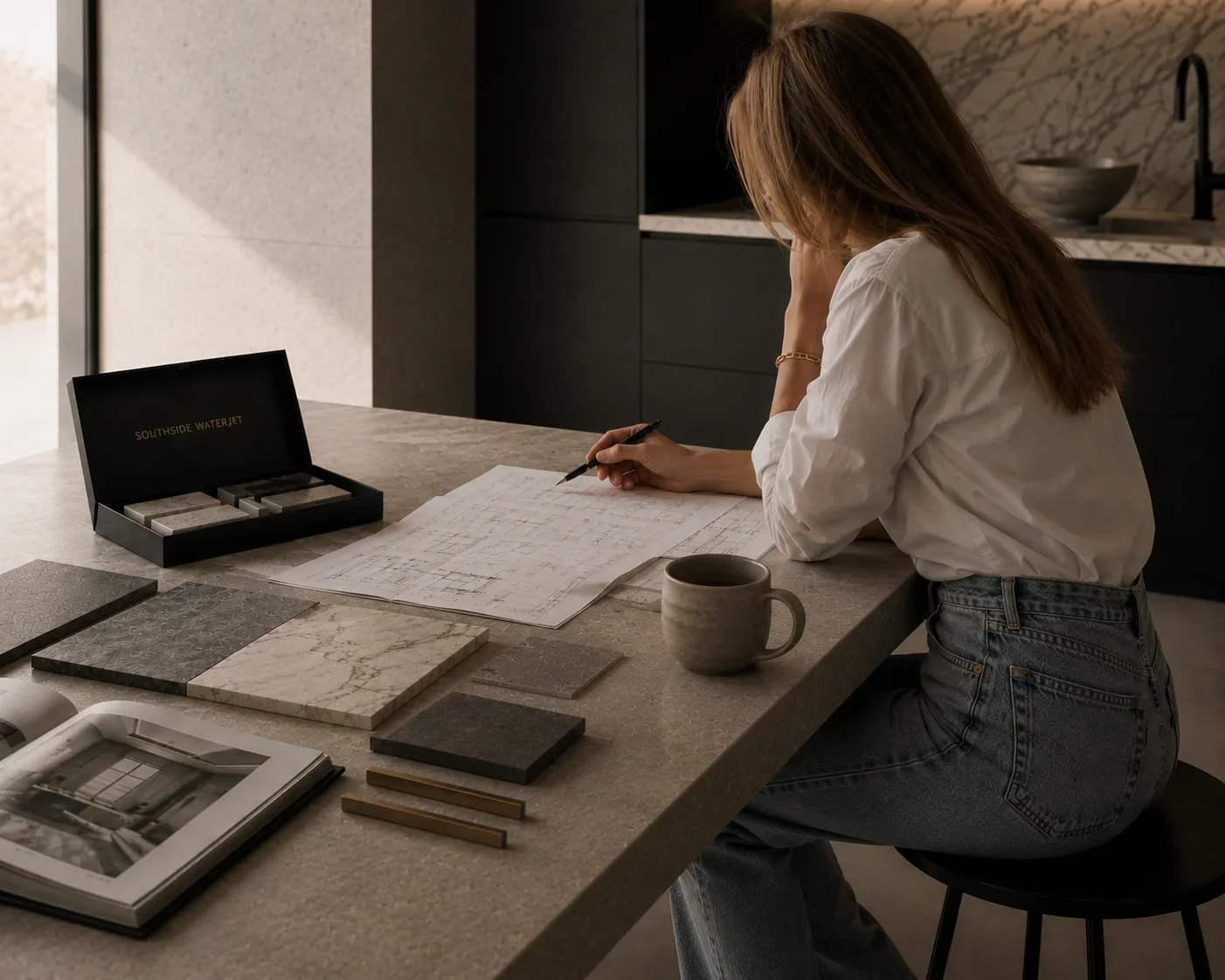
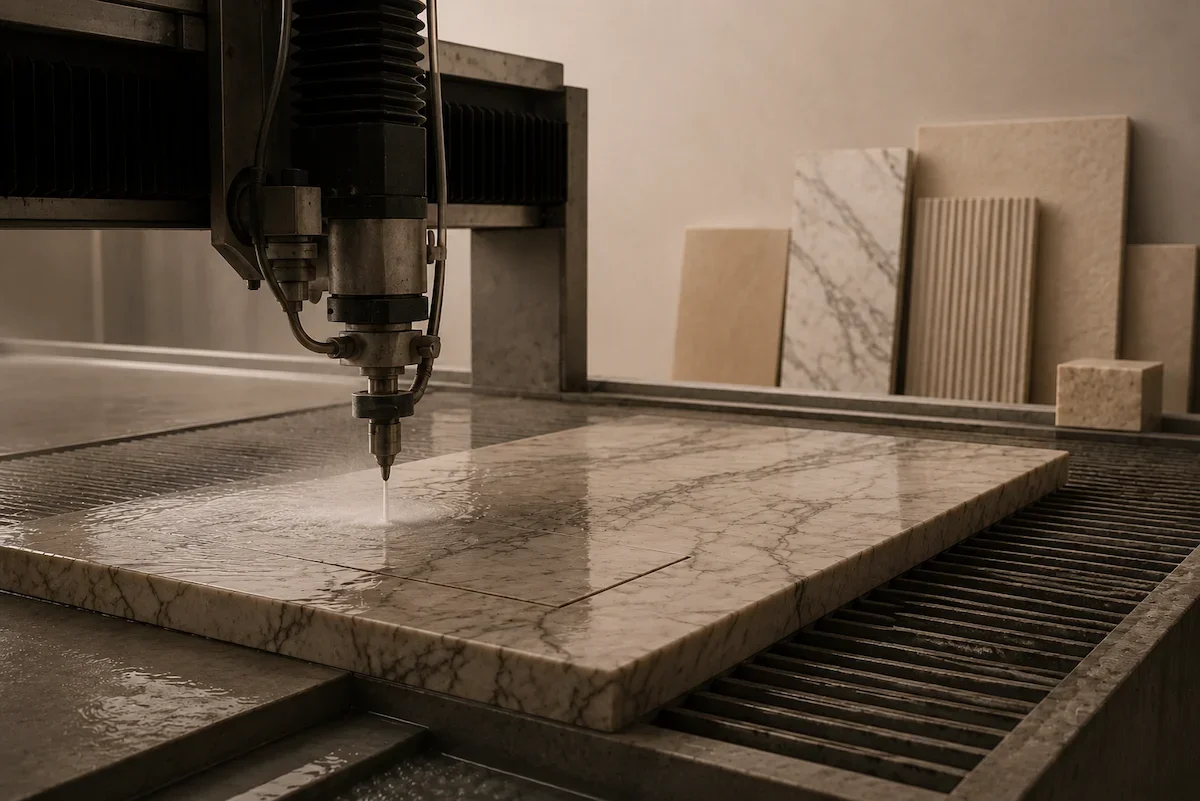
Once the visual direction is established, the artwork needs to be considered alongside the proposed material and fabrication method.
Sharing the lettering, intended dimensions and its position within the wider design gives the fabricator useful context. It also creates an opportunity to discuss which details need further development before production.
At Southside Waterjet, we welcome conversations about incorporating lettering and identity into architectural surfaces.
Have a project in mind?
From a single word to a bespoke floor inlay, talk to us about incorporating lettering into your architectural surfaces.